
The mark
A spine with scoliosis, held by a line beside it: the support Limor gives every patient.
Case study · Branding · Real client
Limor Frishling. A calm, expert brand for a physiotherapist who treats scoliosis with the Schroth method.
- Role
- Brand designer
- Client
- Physiotherapy studio
- Delivered
- Logo, cards, letterhead
- Year
- 2026
The problem
Too far one wayCold and clinical.
Too far the otherSoft and holistic.
Expert and warm.
After years in the field, Limor was opening her own studio for posture disorders. Most physio branding we looked at fell into one of two camps. Her brand had to earn trust with a spine and still feel like home.
Step 1 · Set the criteria
I started with research: how physiotherapy and posture clinics present themselves, and what patients look for. Limor was opening her first studio and still unsure of her place in the field, so building the brand meant building her confidence too. Before drawing anything, we set four values to measure every decision against.
Four criteria, one per breath
Step 2 · Test every direction
What we said yes and no to.

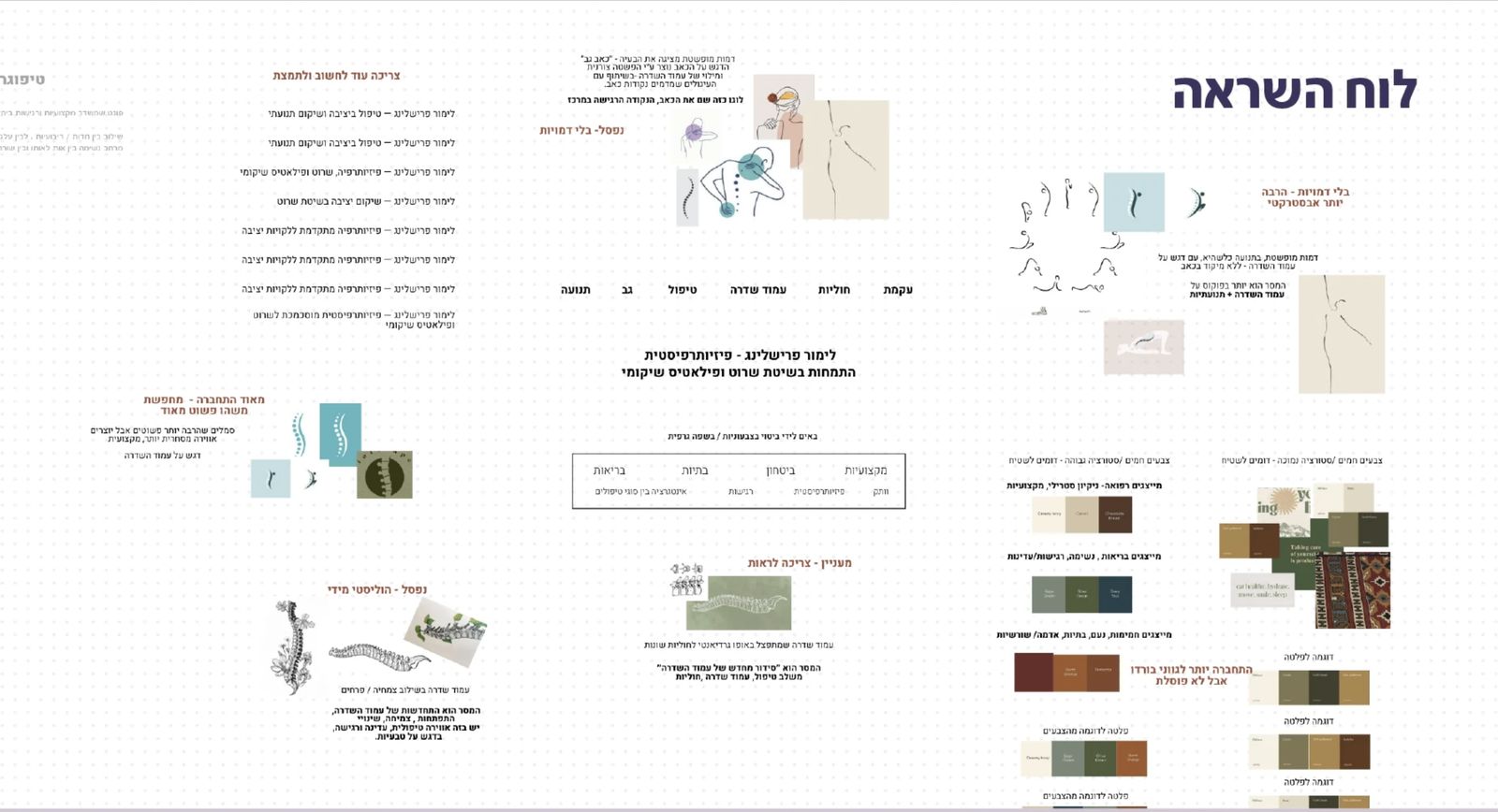
The real board, annotated in Hebrew. Every direction was judged against the four values.
Step 3 · Explore
Dozens of spines before the right one.
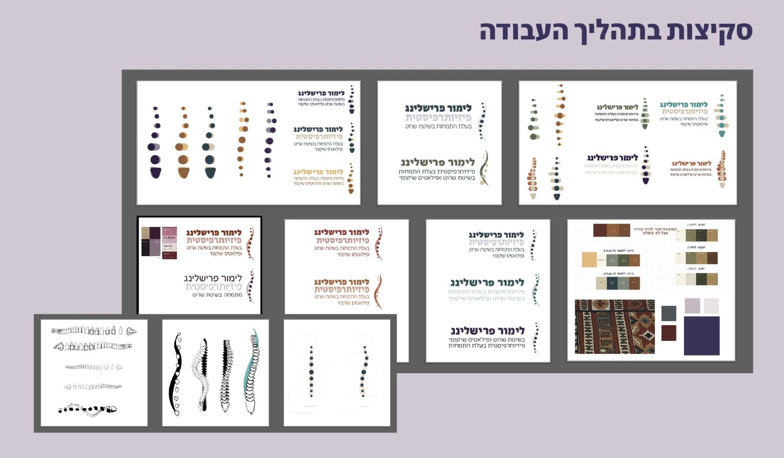
Anatomical, bold, dotted, on a body outline. Then color tests in plum, ochre, teal and earth, until one mark carried all four values.
Step 4 · The objection
“Many logos build a spine from dots.”
When Limor first saw the dots, she hesitated.
Step 4 · The real concern
Her fear: looking like everyone else.
The dots were never the problem. How patients would read them was.
Step 4 · My answer
So I made the meaning impossible to miss.
A spine with scoliosis, and a line that holds it. No generic logo says that. She loved it.

Color · 1 of 3
Deep indigo
Sensitivity, professionalism, innovation#3A335D
Color · 2 of 3
Lavender grey
Calm, cleanliness, care#D1C7D3
Color · 3 of 3
Soft white
Space to breathe#F4F3F2
The result
Ready for opening day.
Limor needed a set she could hand to patients the day her studio opened. Every piece carries the same spine.
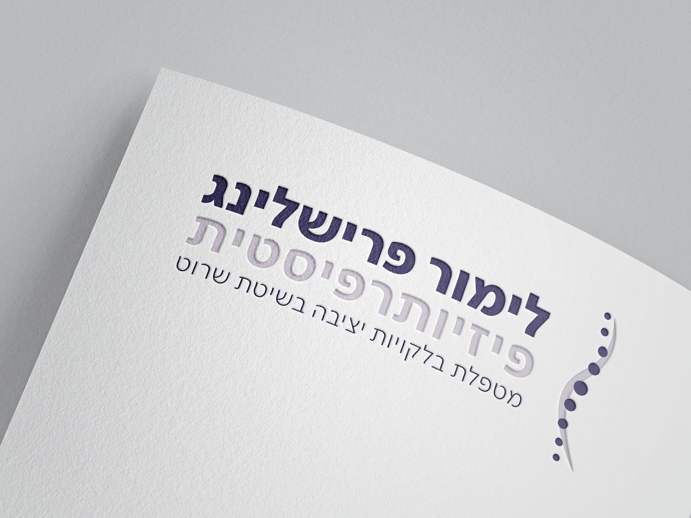
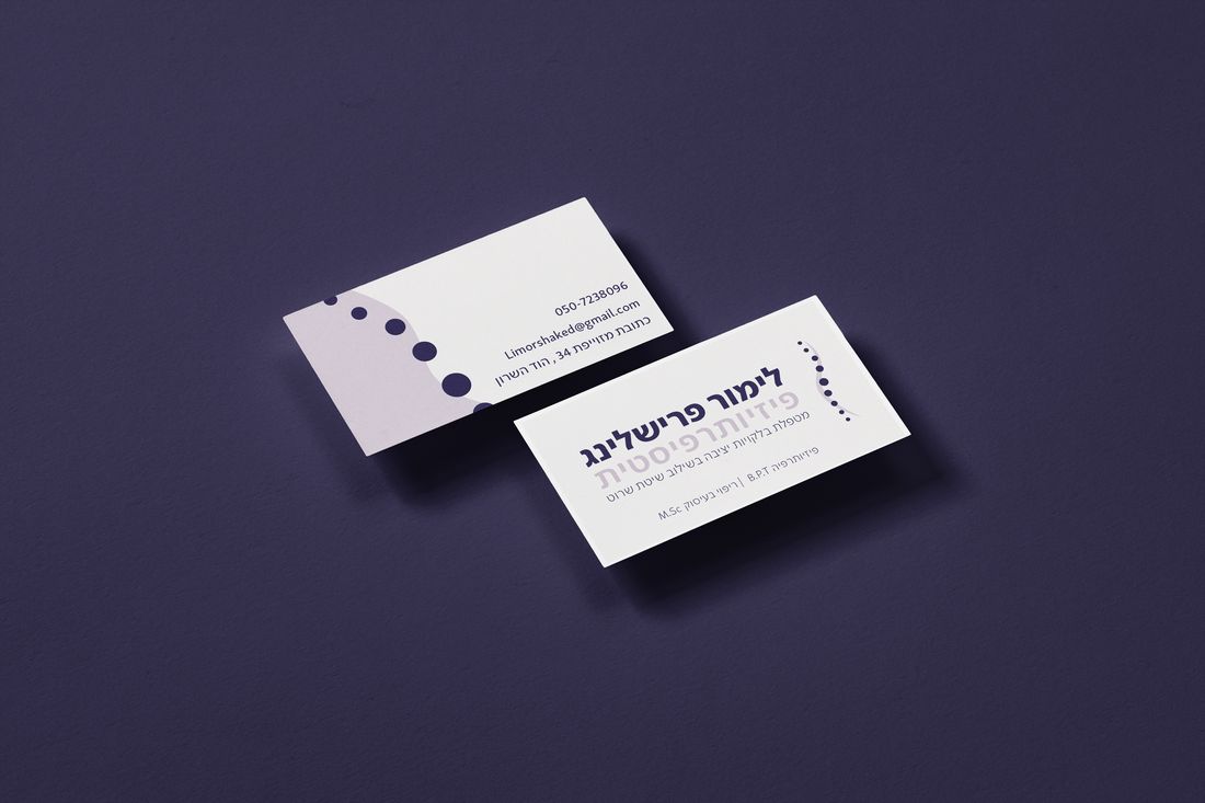
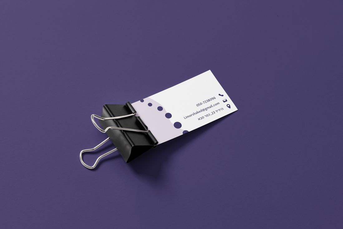
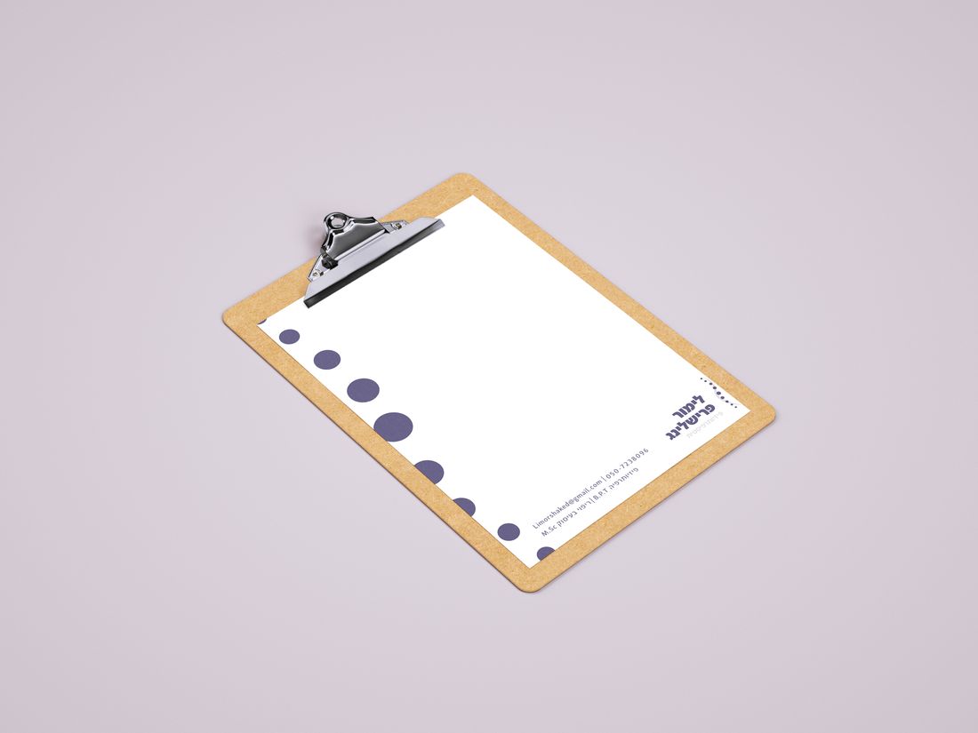
Expert.Warm.A little homey.
The challenge was to look expert without feeling cold. The answer is one supported spine, carried through a mark with a story, a calm palette and print pieces ready for opening day.
I'd design her whole studio: the walls, wall stickers and the space patients walk into, in the same visual language. And I'd keep building her confidence, with a brand that shows she belongs in a medical field that doesn't always make room for women.
Next project
Soft Ritual →