Clarity. A health companion that turns stressful data into gentle, lasting habits.
▶Watch the first day · 78 sec- Role
- Lead UI/UX + research
- Time
- 4 weeks, 2026
- Platform
- iOS app + Apple Watch
- Tools
- Figma, Procreate, Claude
The problem
Health apps bury people in numbers.
The core problem
Starting strong. Hitting a wall. Feeling like a failure.
That's the cycle Clarity was built to break. Health apps show more data, not more meaning: a missed goal reads like a grade, and nothing tells you what to do next.
Who it's for
Three personas. Three different problems Clarity solves.
How I found them. I interviewed people about how they use health apps, then grouped what they told me by goals, habits and frustrations. I merged those answers into three personas, so each one is a mix of real interviews, not one real person. None of them leads: all three shaped the product equally.
 The dreaming beginner
Maya 24
Burnt out by screens, unsure where to start, afraid of judgment and guilt. Needs low pressure and very small first steps.
 The wall hitter
Guy 40
Trains seriously but has plateaued. Finds his data shallow or hard to reach.
 The high-achiever
Daniel 32
Long hours, little time. Needs to know when to push and when to rest.
From paper to pixels
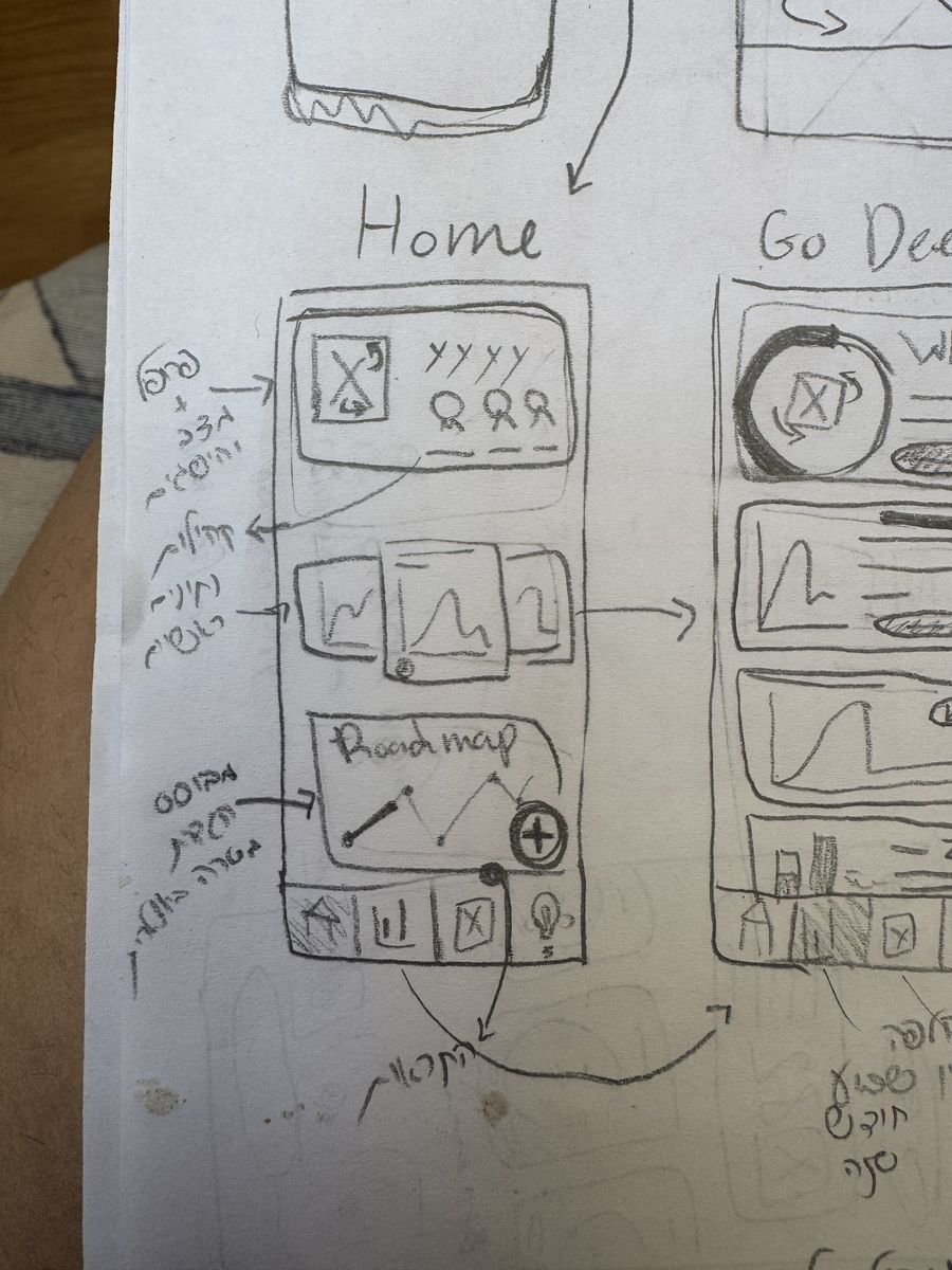
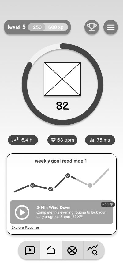
Each screen started as a hand sketch, became a grey wireframe, and was refined into the final UI.
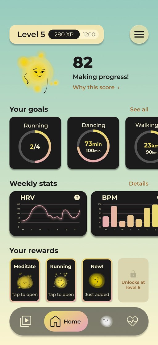
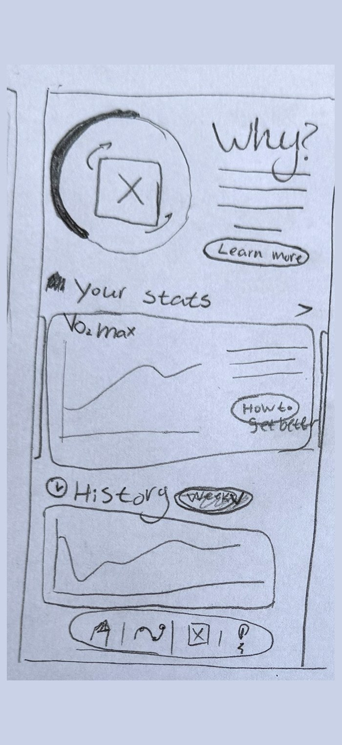
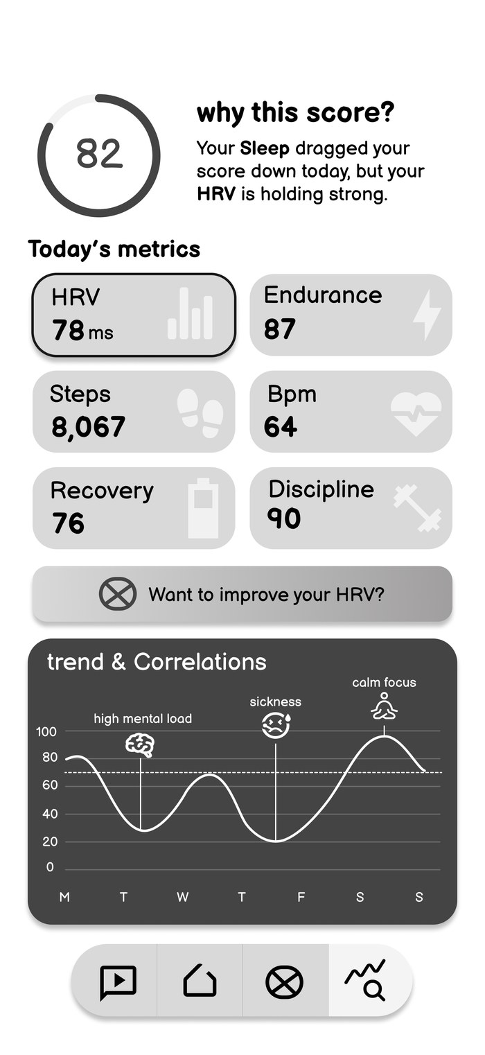
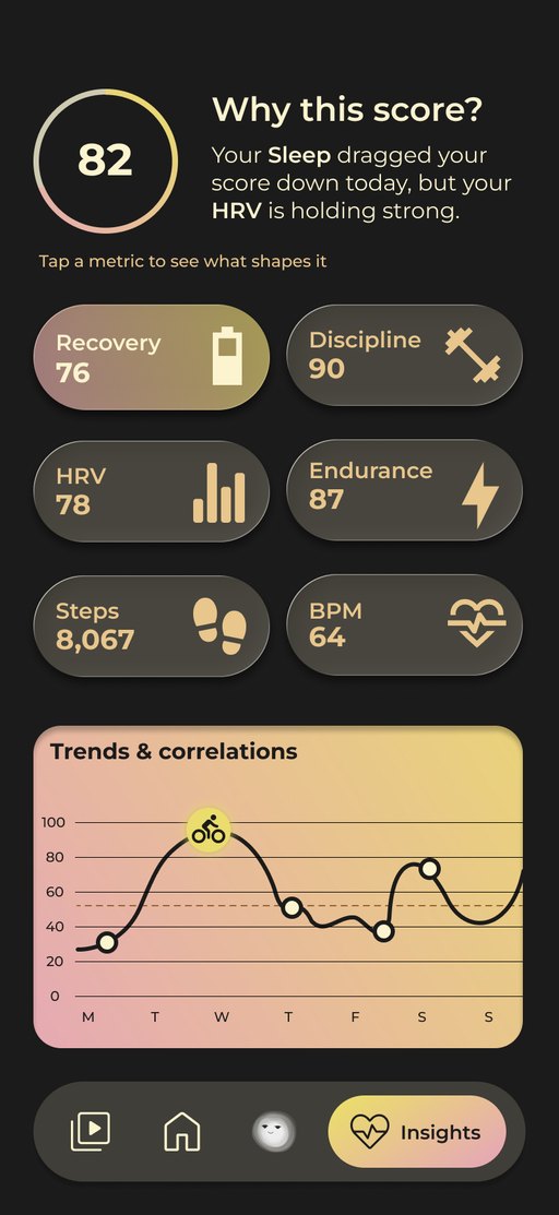
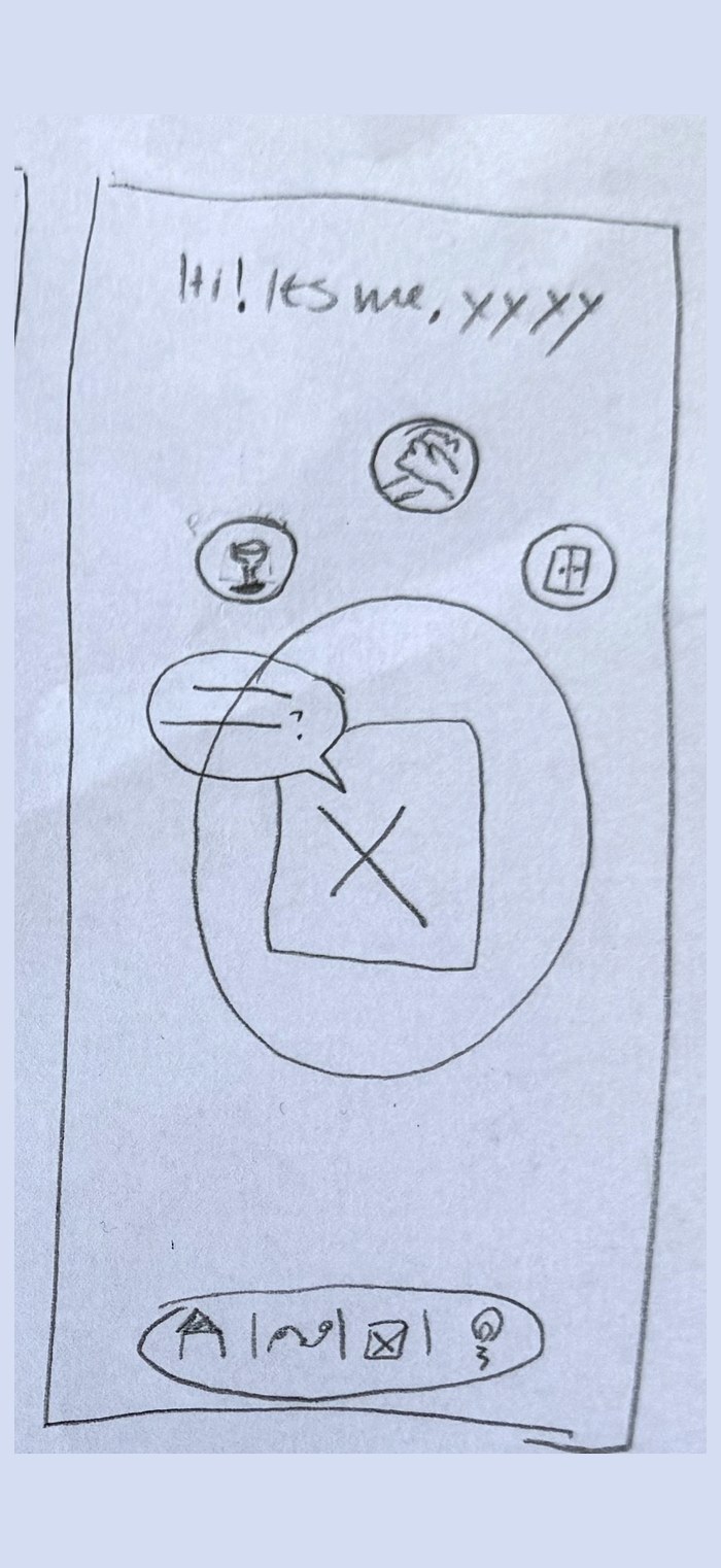
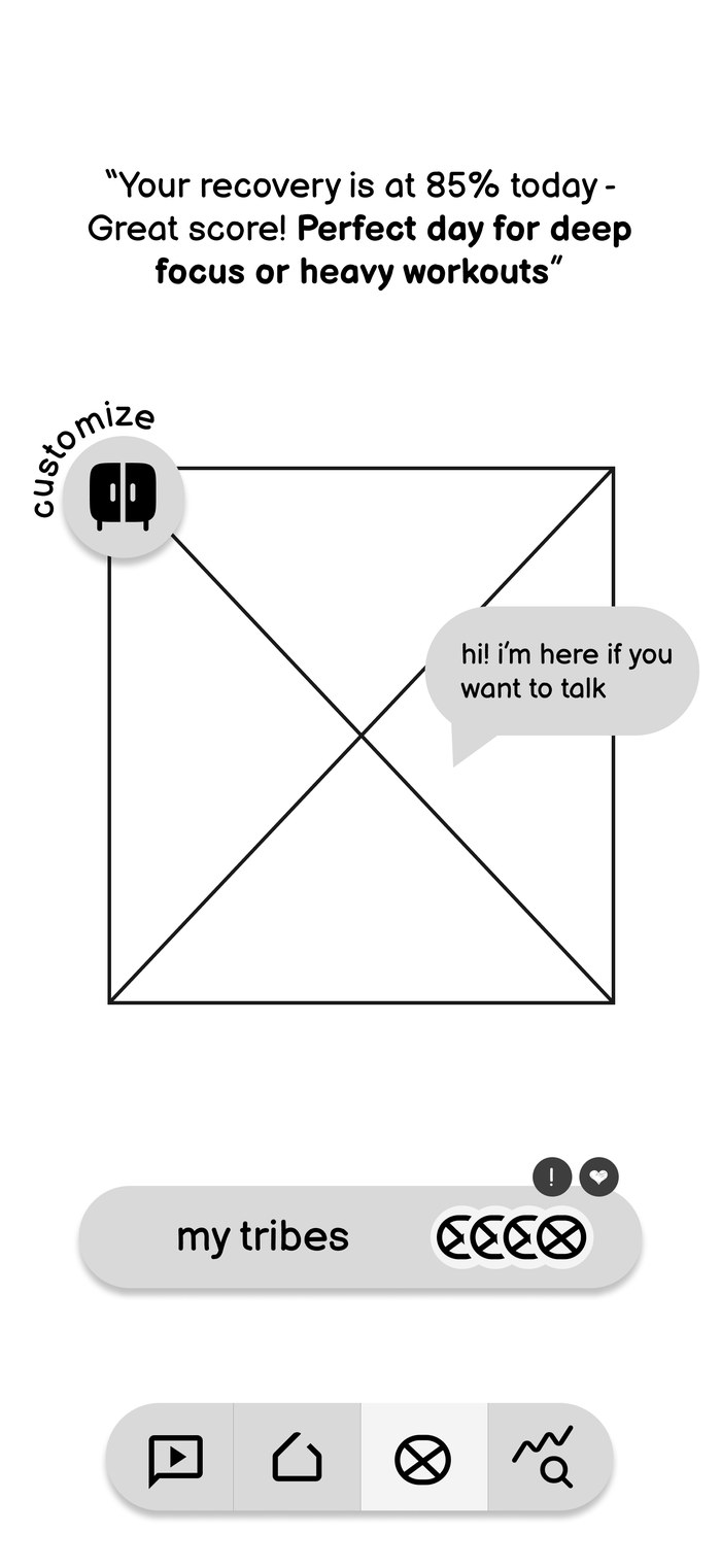
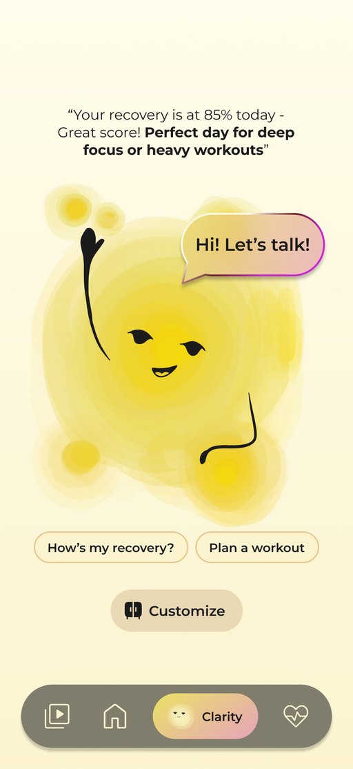
Data-tracking Habit-building.
The solution: meet the companion
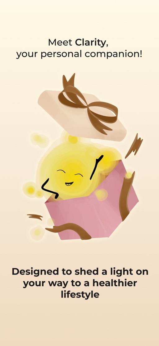
A little light that lives in your phone.
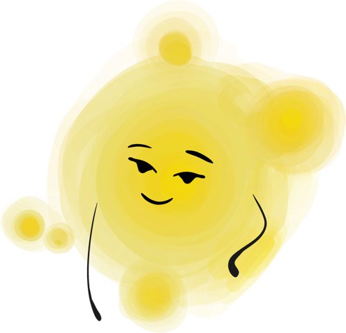
Soft, rounded and translucent. I illustrated it by hand in Procreate, then designed its moods, expressions and voice. Users can name it, dress it and chat with it. It nudges, never nags.
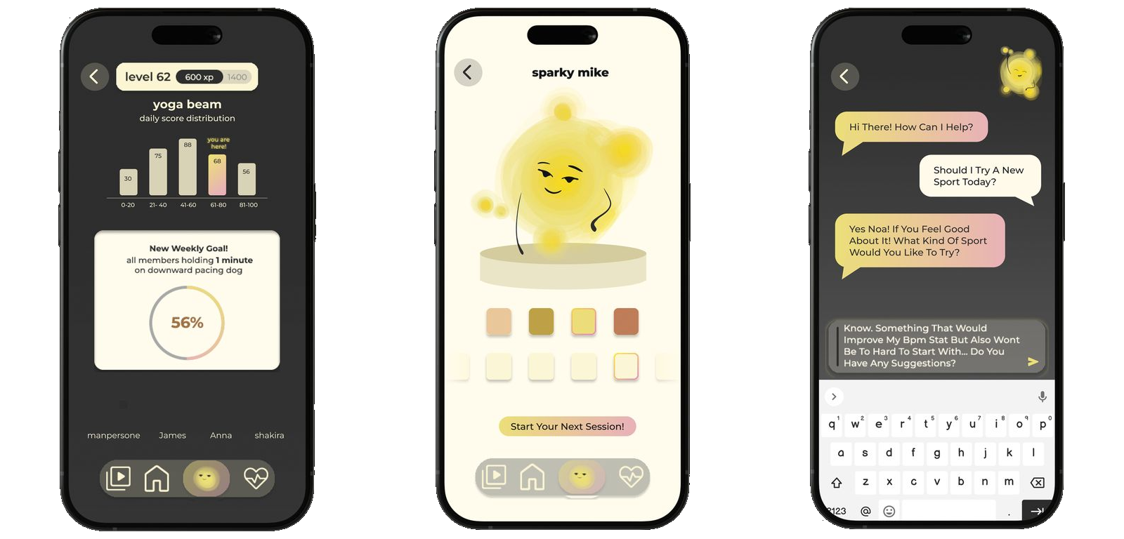
Group goalsConnect with other users, reach goals together and keep each other going.
Dress up "sparky mike"Based on the IKEA effect: when you build something yourself, you like it more.
Always someone to rely onTalk about your day with the companion, any time.
The key decision
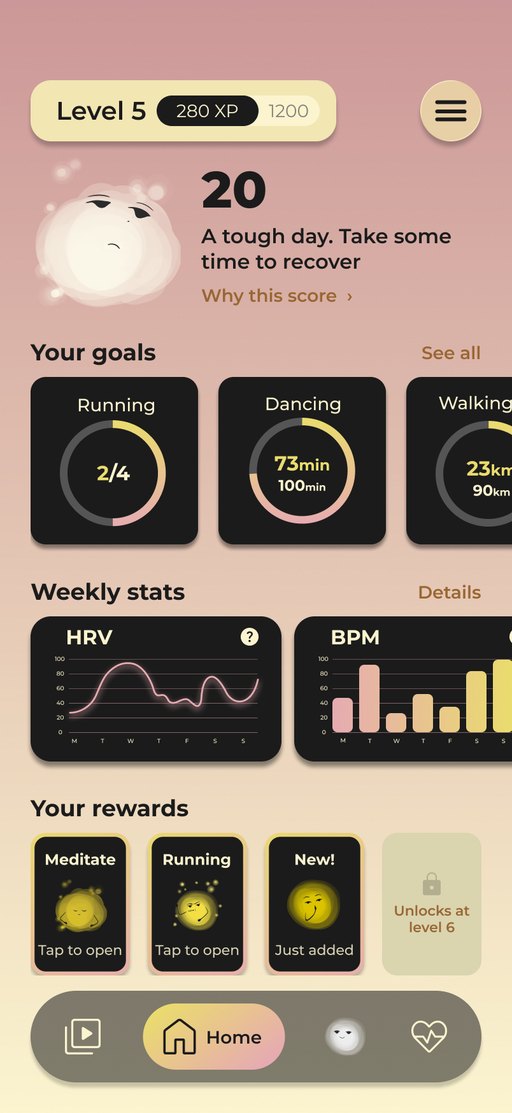
82Making progress!
A low score never reads as failure. In the interviews, people said bad numbers made them feel judged and guilty. So on a hard day the screen turns warm and soft, the light dims, and the app suggests rest instead of a warning.
Refining it · Nov 2026
Same Clarity. Better built.
I came back with one rule: keep the palette, the illustrations and the structure. Only spacing, hierarchy, components and interactions could change, and every change needed a reason.
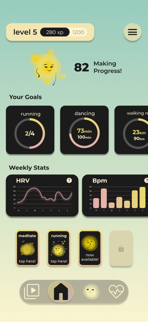
Drag the line on the phone to compare.
One decision I changed
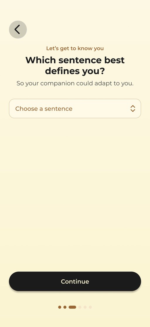
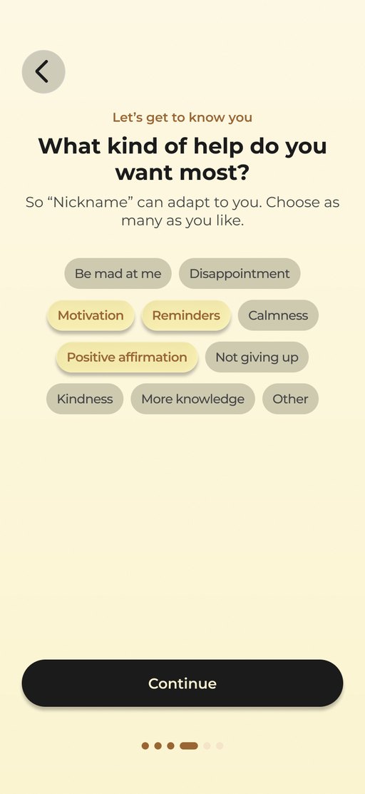
Three questions, three pages.
“Get to know you” was one screen with three questions, and it felt like homework. The questions came from my own survey research, so I kept every one, but gave each its own page: one question, one tap forward, and dots that show you’re almost there.
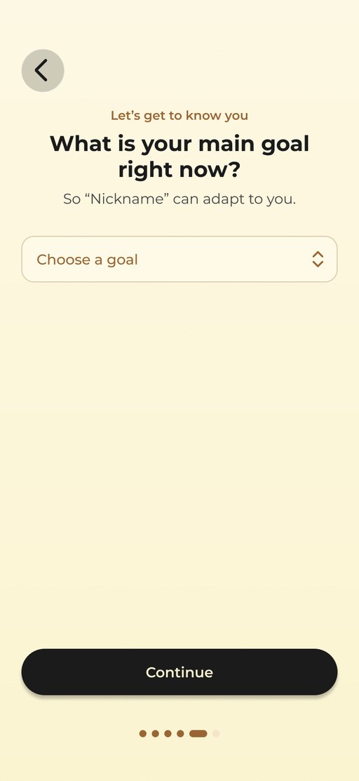
How I worked. I refined it with Claude directly in Figma. Its first pass was too polite to notice; its second started restyling screens, so I stopped it. The useful part came from my own rejections: tags too dark, a star button no one could explain, labels under every tab.
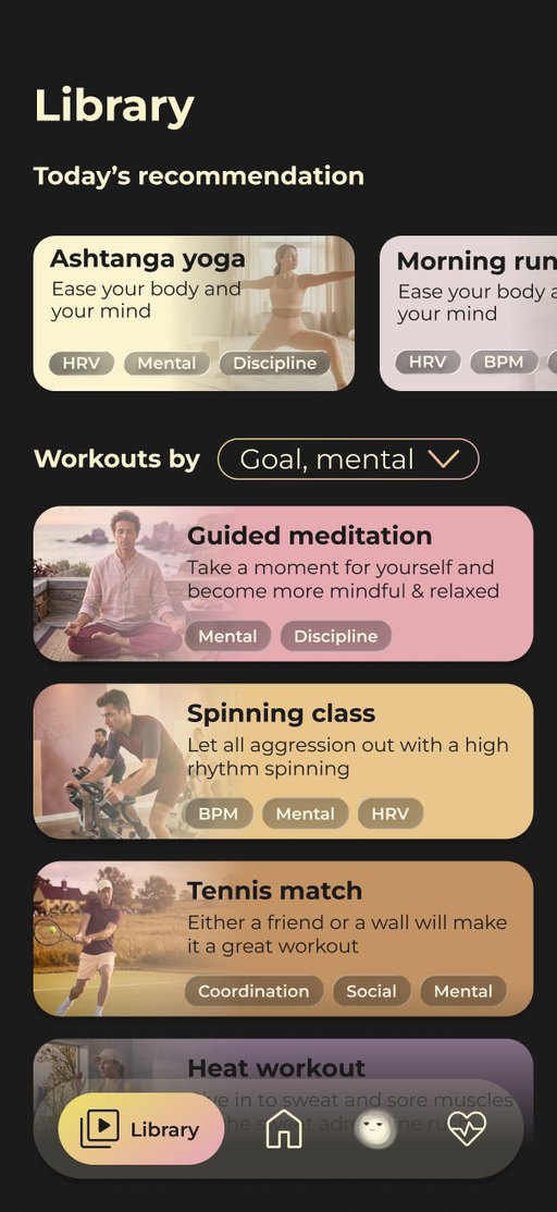
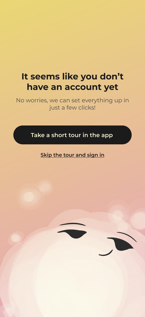
Inside the app.
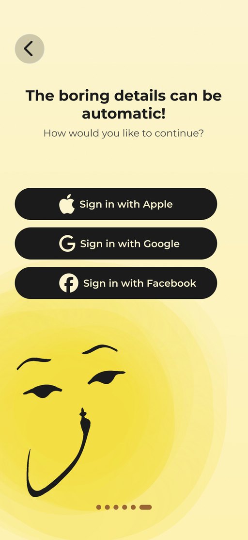
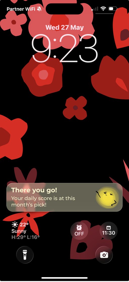
From the first glow on the loading screen to a friendly note on the lock screen.
▶Watch these screens in motion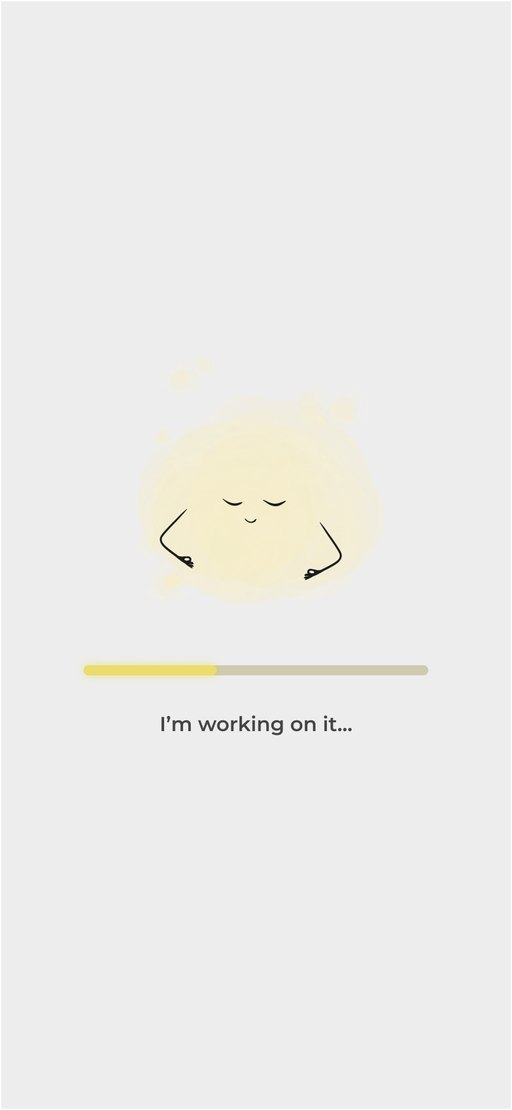
On the wrist
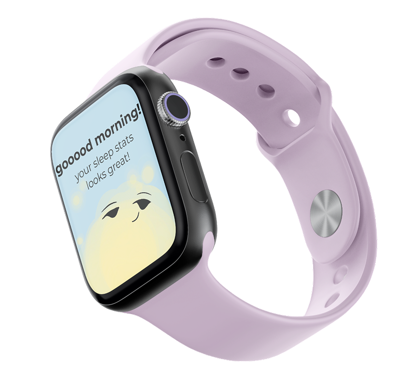
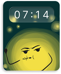
One character, many moods.
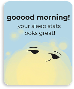
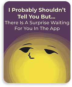
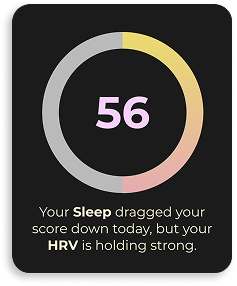
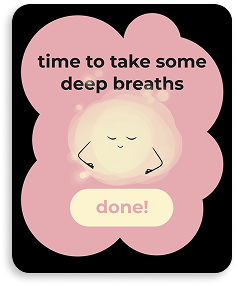
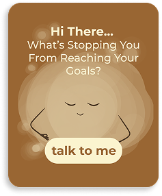
On Apple Watch, the companion offers support at the right moment: a good-morning note about your sleep, a few deep breaths, a nudge to rest. Large type and short messages, built for a glance.
See it in use
The first day, start to finish.
The refined screens, wired the way the prototype links them: sign up, make Clarity your own, three quick questions, today's score and why, a new goal, the library and a chat with the companion. Jump to any step.
Where it landed
A guide, not a judge.
Clarity helps you without judging you, shows you the way, and keeps you motivated, all at once. A complete iOS and Apple Watch concept in four weeks, built on real interviews. The first thing I would test next: the hard-day screen, with real users.
A low score never reads as failure. Rest also counts as progress.
Every score comes with one small next step, in plain words.
A companion you dress yourself, shared goals with friends, and gentle nudges on your wrist.
Next project
Kinetic →