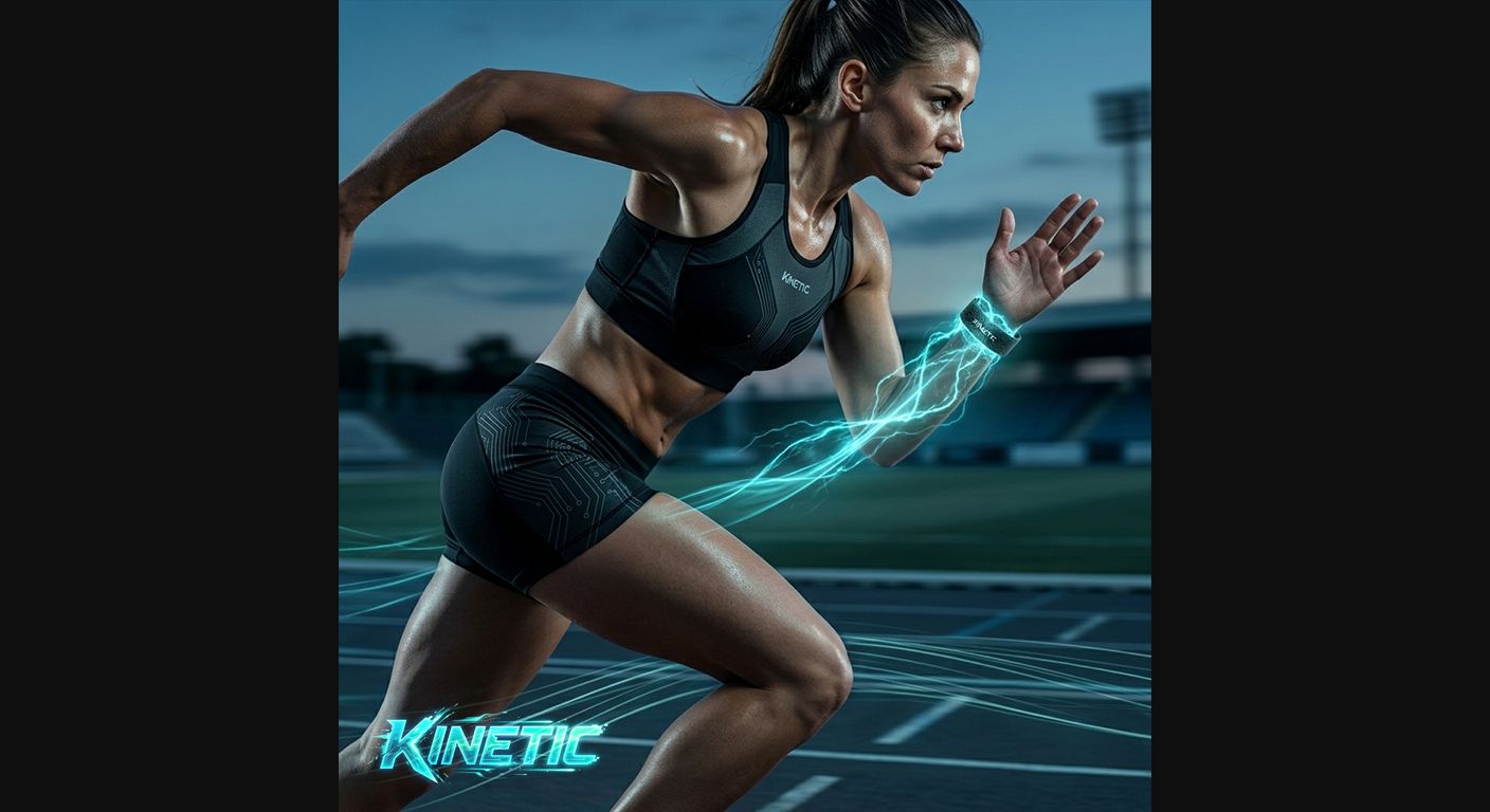

Case study · UI/UX · E-commerce
Kinetic. An e-commerce concept for a smart sports-gear brand.
- Role
- UI/UX designer
- Type
- Self-initiated concept
- Scope
- Home, product, cart, mobile
- Tools
- Figma, AI imagery
The problem
My friend had a whole brand in his head, and nothing to show anyone.
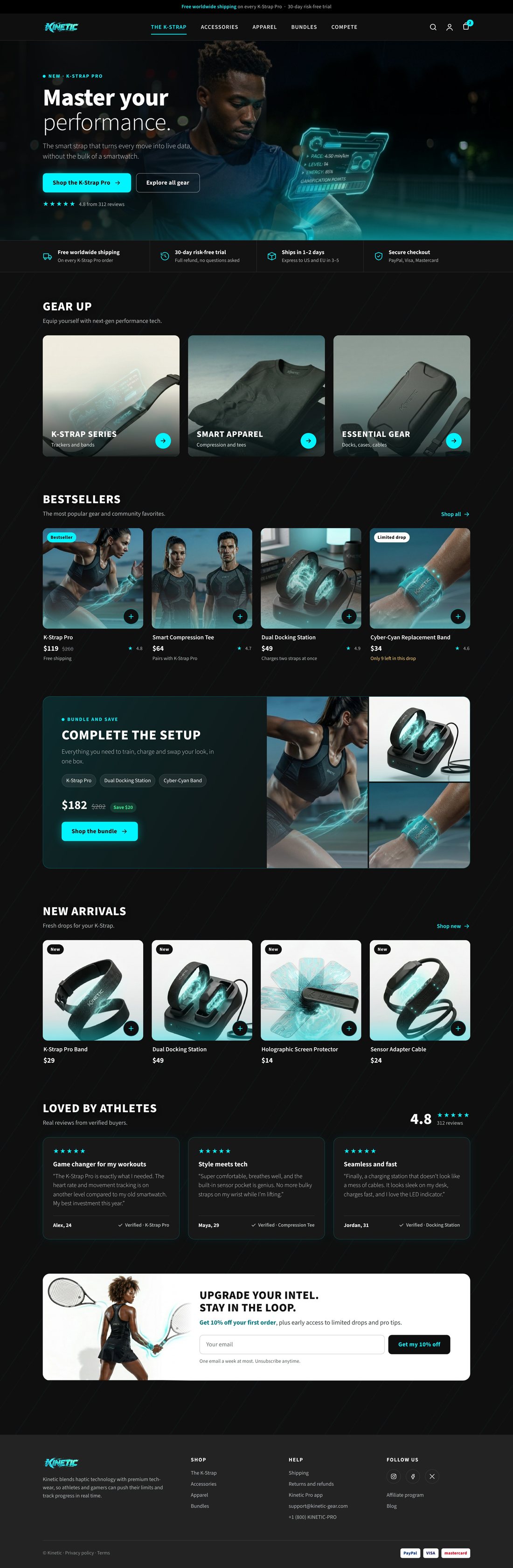
He kept describing a line of smart sports gear. So I designed its store before the first product existed, so he could see his brand instead of only describing it.
The idea
Gear that looks as fast as it performs.
A dark interface with a cyan pulse, so every product feels charged with energy and data.
The key decision
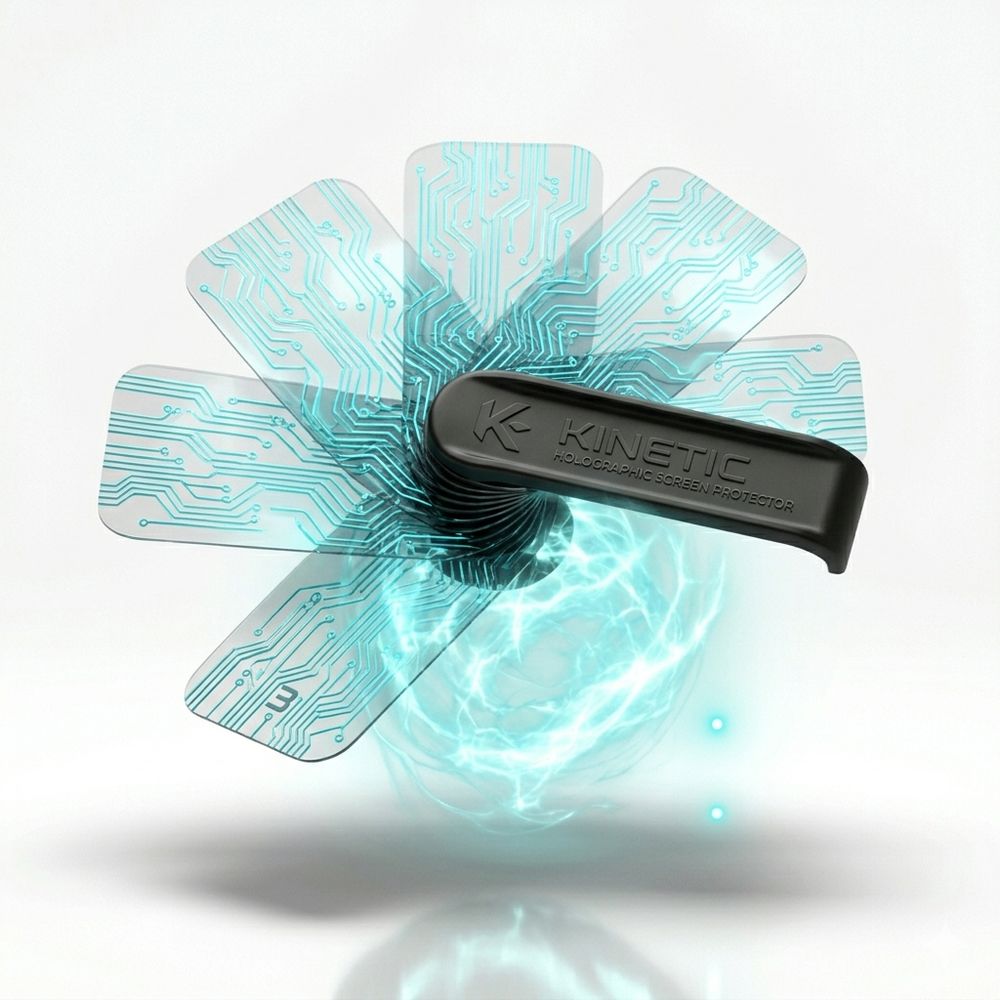
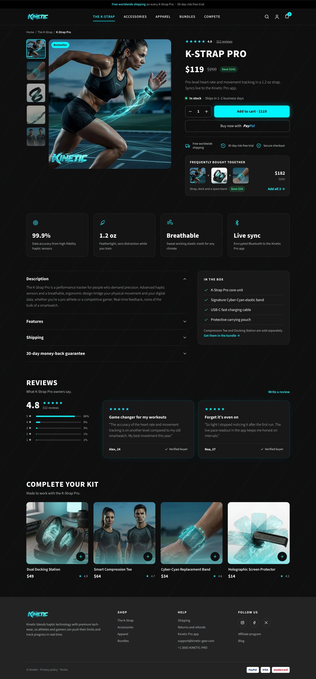
Go dark, not white. On a bright white page this gear would look like any other gadget. It is built for data and night training, so I put it on a dark stage with one cyan light: every product looks switched on, and the cyan carries straight into the brand, the UI and the photos.

Why it sells
Built to sell.
A store has one job: help the right shopper buy with confidence. These UX choices raise the chance they do.
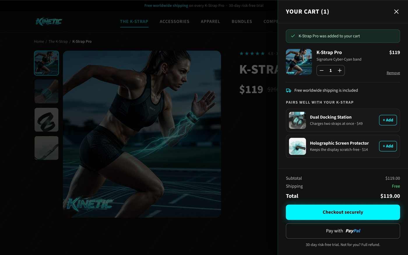
- The cart is always one tap away.Every header shows the cart with a live count. Add to cart opens a drawer instead of a new page, so shopping keeps its momentum.
- Proof sits where people decide.Ratings, verified reviews and bestseller badges appear on the cards and next to the price, not hidden at the bottom.
- Doubts are answered at the button.Free worldwide shipping, a 30-day risk-free trial and secure payment sit right under Add to cart. The button itself shows the price.
- Fewer steps to buy.Quick add on every product card, PayPal express checkout, and a buy bar that stays on screen on mobile.
- A good reason to add more.Bundles and "pairs well with" add-ons, each with a one-line reason and a real saving.
Persuasive, never pushy: no fake countdowns, no pre-checked extras, no hidden fees.
Product imagery
Art-directed with AI.
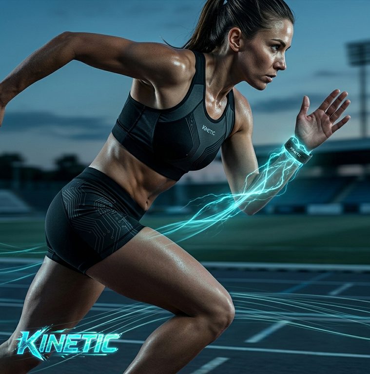
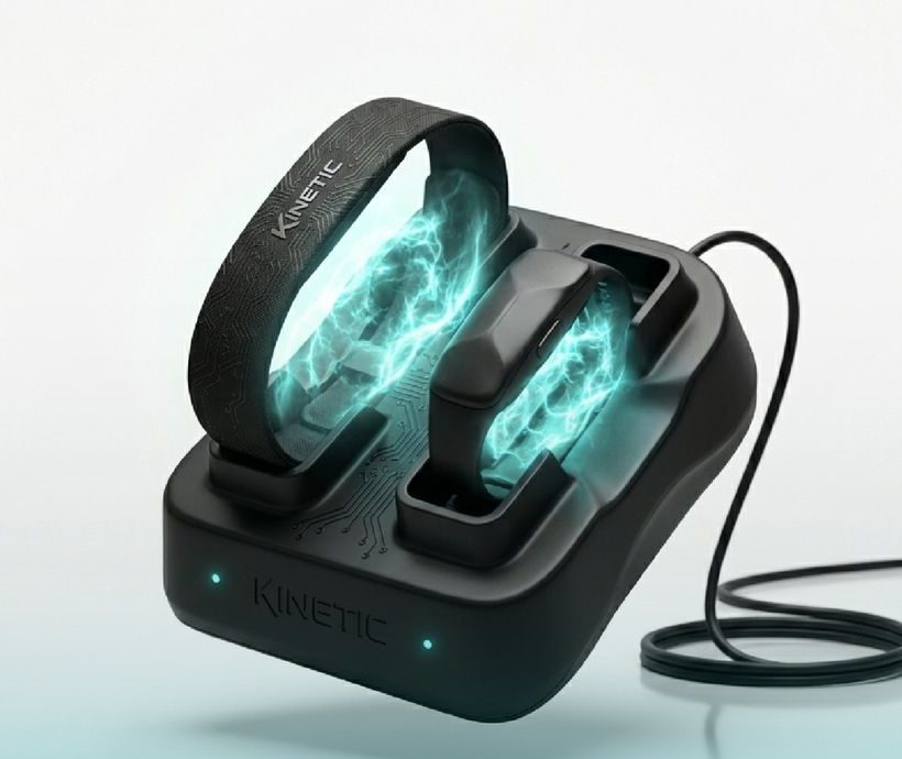
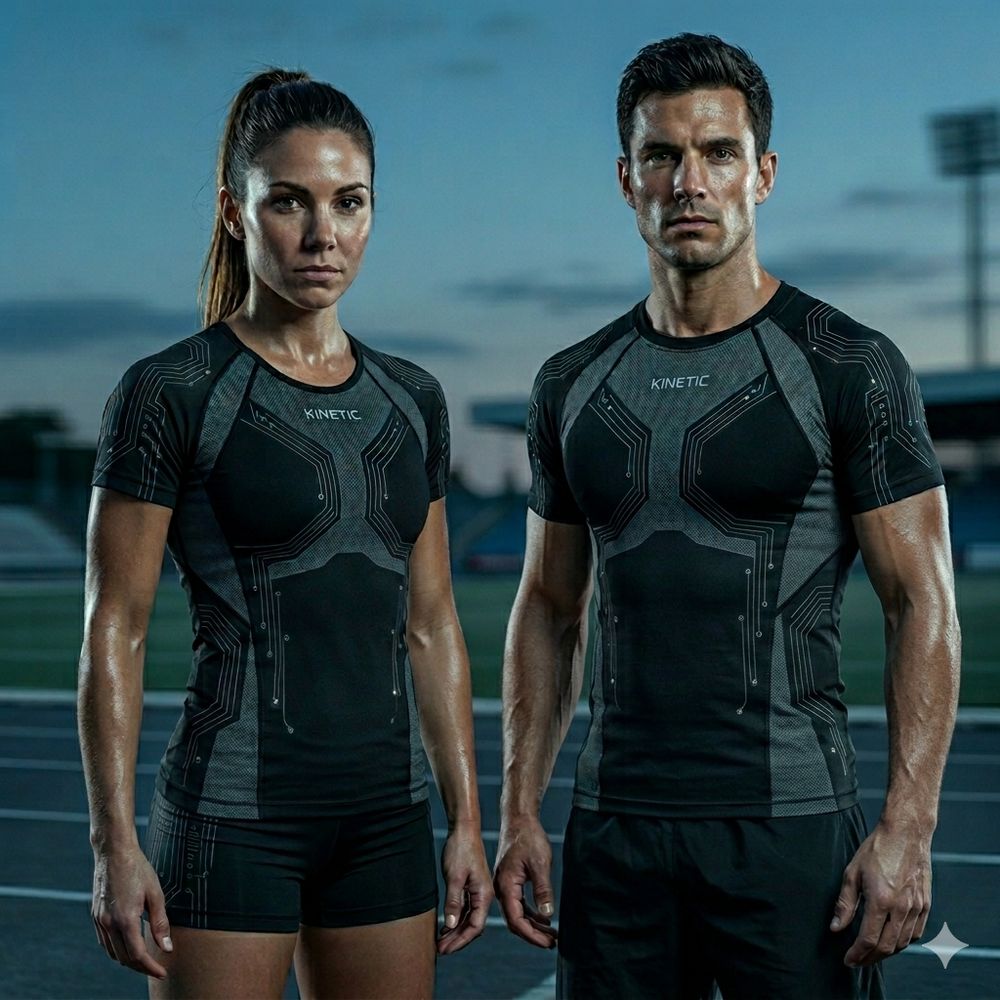
I made the images with Gemini and art-directed every one to one look: night stadium, cyan light, sweat and speed. Move your cursor to light it up.Tap the photo to light it up.
How I directed it
Gemini needed rules, not prompts.
Gemini needed steering. I wrote a rule set for the images, and kept directing and refining it until every image followed it.
- The productsThe gear follows Kinetic's design language, not generic sportswear.
- The peopleAnatomically correct, every time: hands, faces and bodies.
- Dressed rightEveryone wears the gear, the way real athletes would.
- One worldEvery shot lives in the same graphic world, like one shoot.
What happened next
He 3D-printedthe products.
When I showed him the store, my friend was so excited that he 3D-printed mock versions of the gear to match it. His idea went from something he could only describe to a brand he could see, click through and hold.
Next project
Limor Frishling →