
Evenly. Settling up between partners, without keeping score.
- Role
- Research, UX, UI, design system
- Time
- 10 days
- Platform
- Responsive web, Hebrew RTL
- Workflow
- AI-augmented, led by me
The problem
- Most young couples keep separate accounts.Two salaries, two cards, two banking apps.
- But they share most of their expenses.Rent, groceries, gas, dinners out. Each one paid from whichever card was closer.
- So at the end of the month, someone has to sort it out.Wasting an evening trying to remember which expense went where, and who needs to send whom how much.

Some sit down with a calculator.
Bills from five utility sites, two card statements, one long evening.
Most just gave up.
"It evens out," they say. Then they keep score in their heads, feel used, resent their partner, or simply fight more often about money.
"Keeping score in a relationship isn't nice. Remembering who paid what is exhausting."Survey answer, translated from Hebrew
Research
I asked 22 people how they handle shared money.
12 of them are couples with separate accounts. Here is what they told me:
don't track shared costs at all. But they would, if it were easy and fast.
couples with separate accounts have argued or felt awkward about money between them.
of everyone asked had friction over splitting. The math was never the hard part. Keeping score was.
Plus desk research on Splitwise, Tricount, Honeydue and Israeli apps. A small sample, but a clear direction.
What they asked for
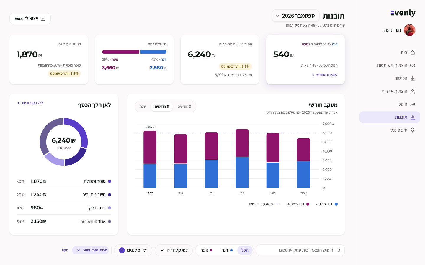
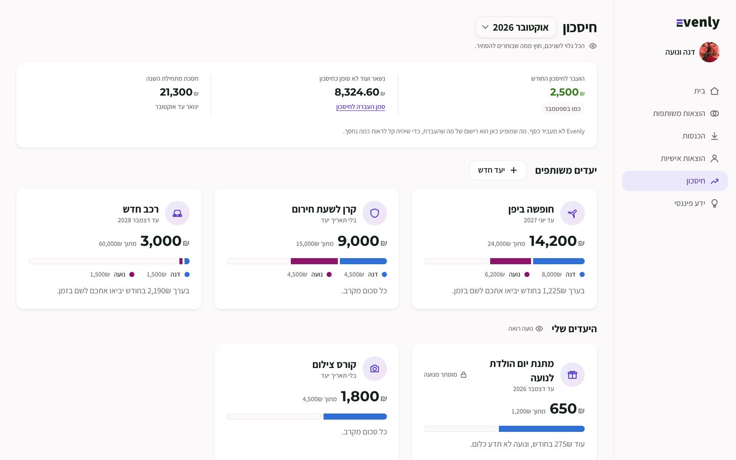
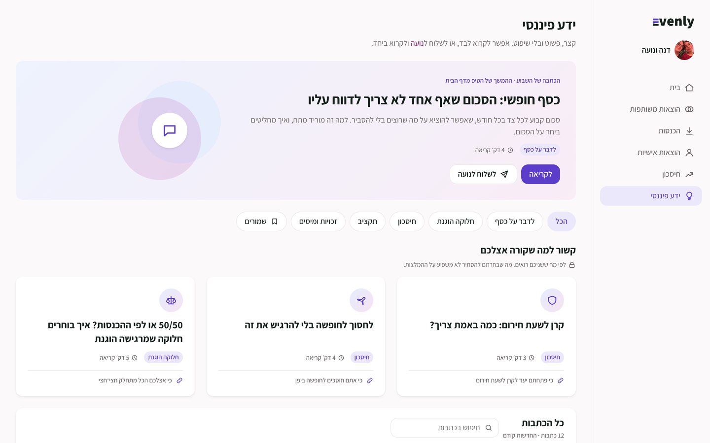
Show us where the money goes. Help us save.
"There's no one place that holds it all together."Survey answer, translated from Hebrew
The solution
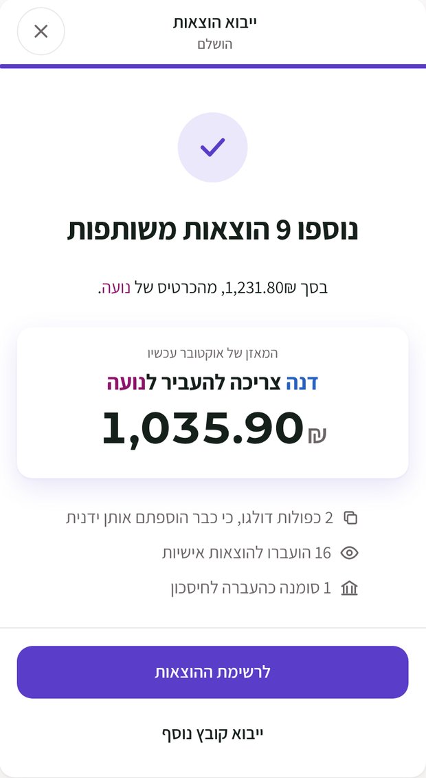
Drop in the card file. The month sorts itself.
- Upload the card statementMax, Cal, Isracard or any bank file. Unknown files take 3 questions.
- Evenly marks what's sharedBased on past months. Clean merchant names, duplicates flagged.
- One answer for the monthNo calculator, no five utility sites, no keeping score.
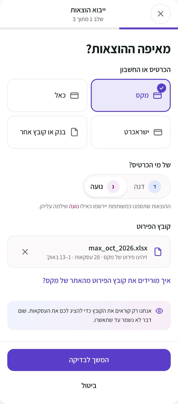
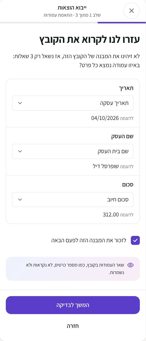
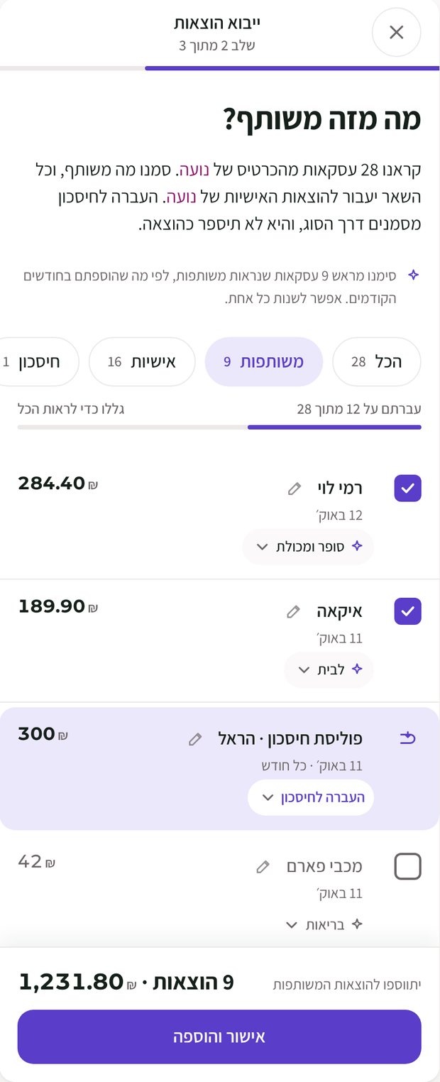
What I heard → what I designed
Four insights. Four screens.
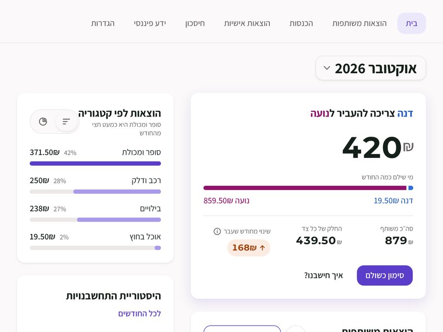
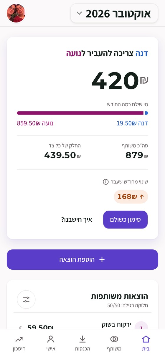
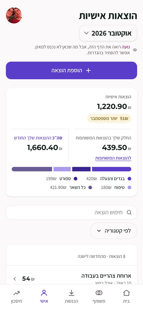
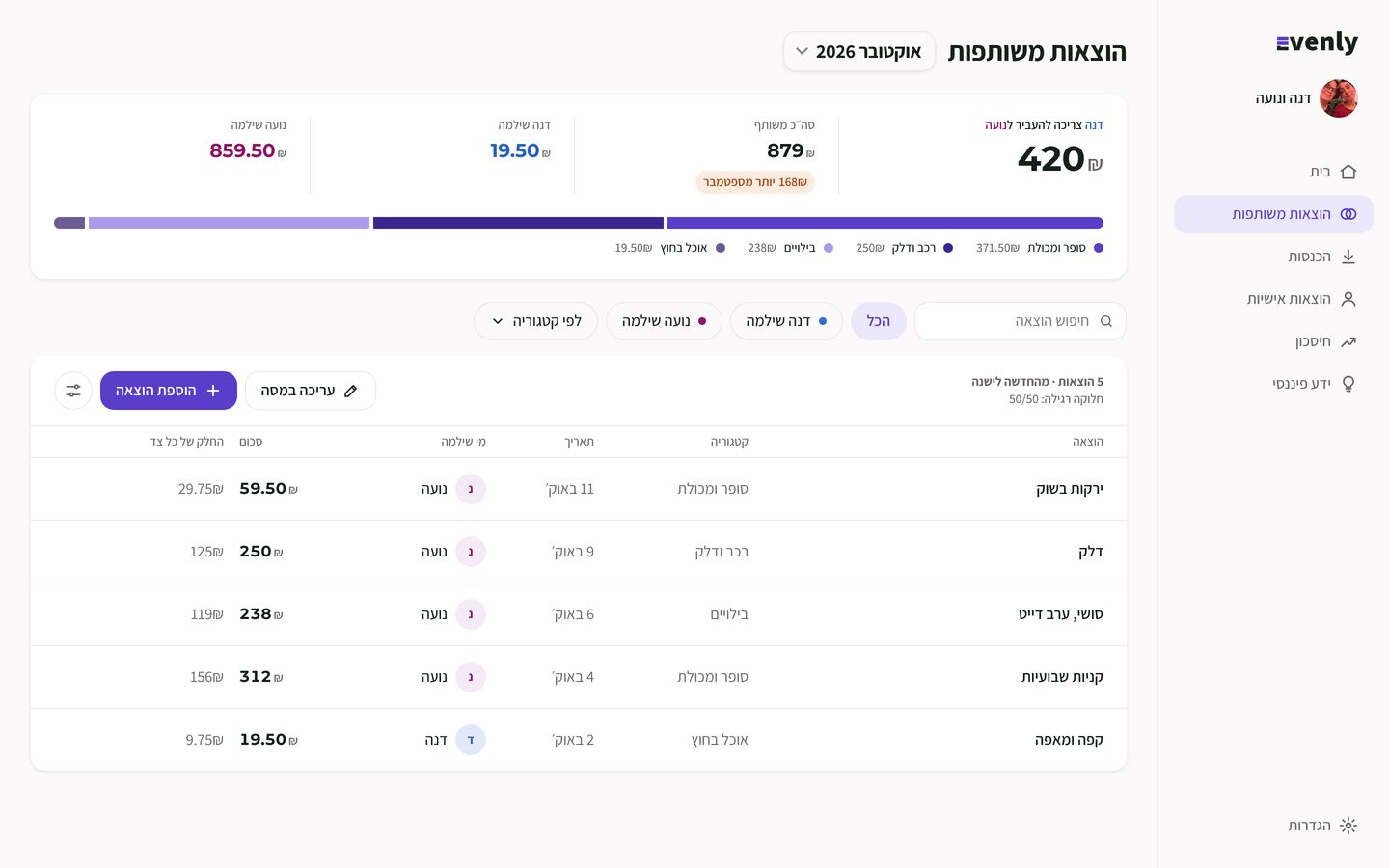
Home leads with the most important answer: who sends how much.
Everything else on the screen explains that number.
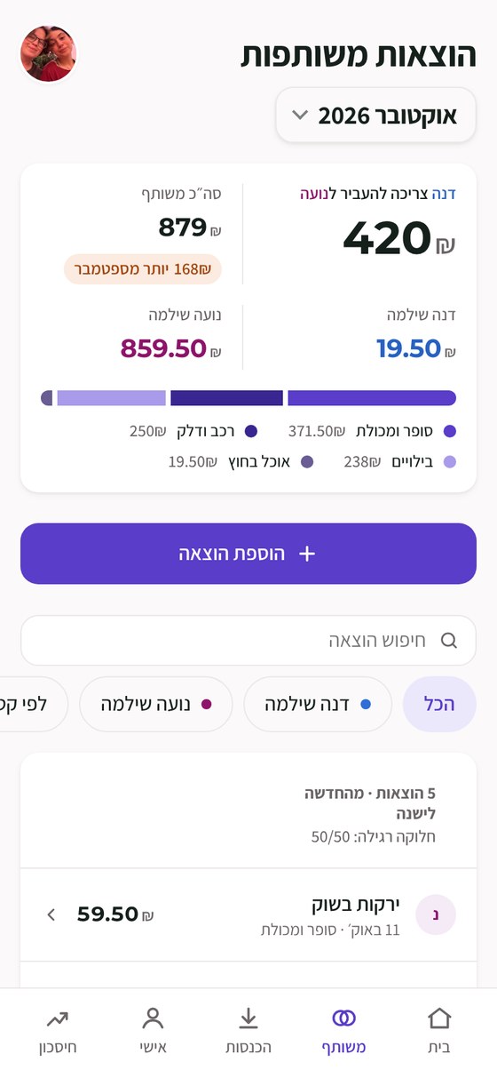
Every expense shows the store you know, not the company behind it.
Card files often list the business name instead of the shop people remember. Evenly shows the familiar name, and keeps the bank's original line underneath, so nothing is hidden.
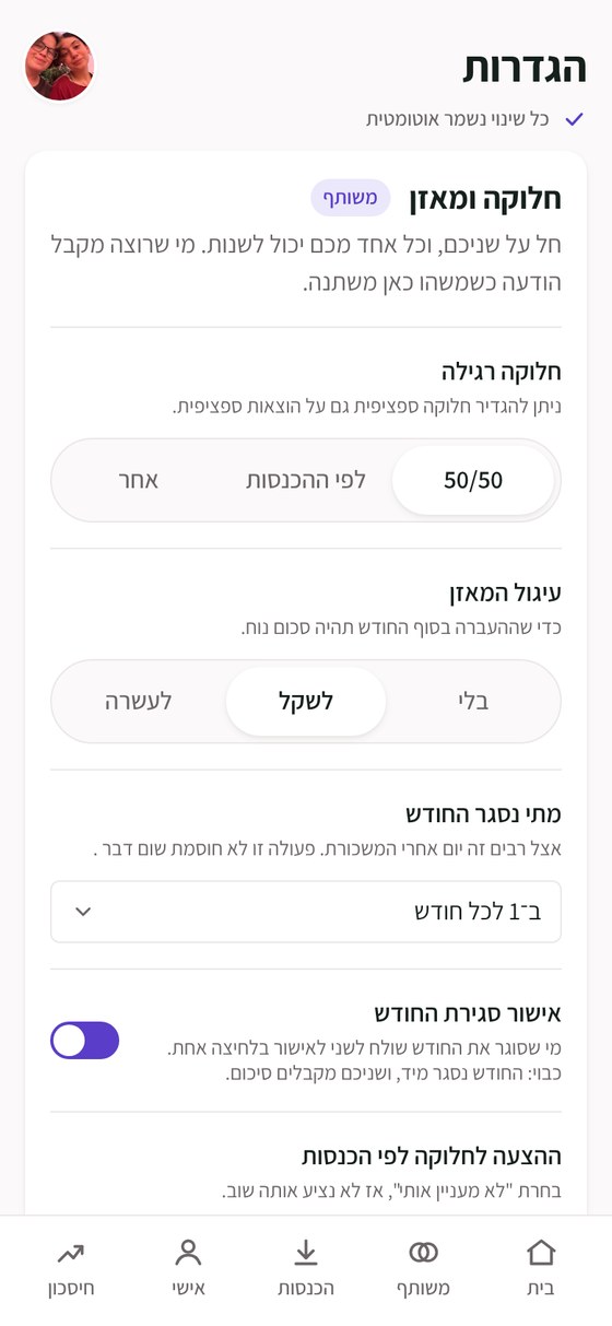
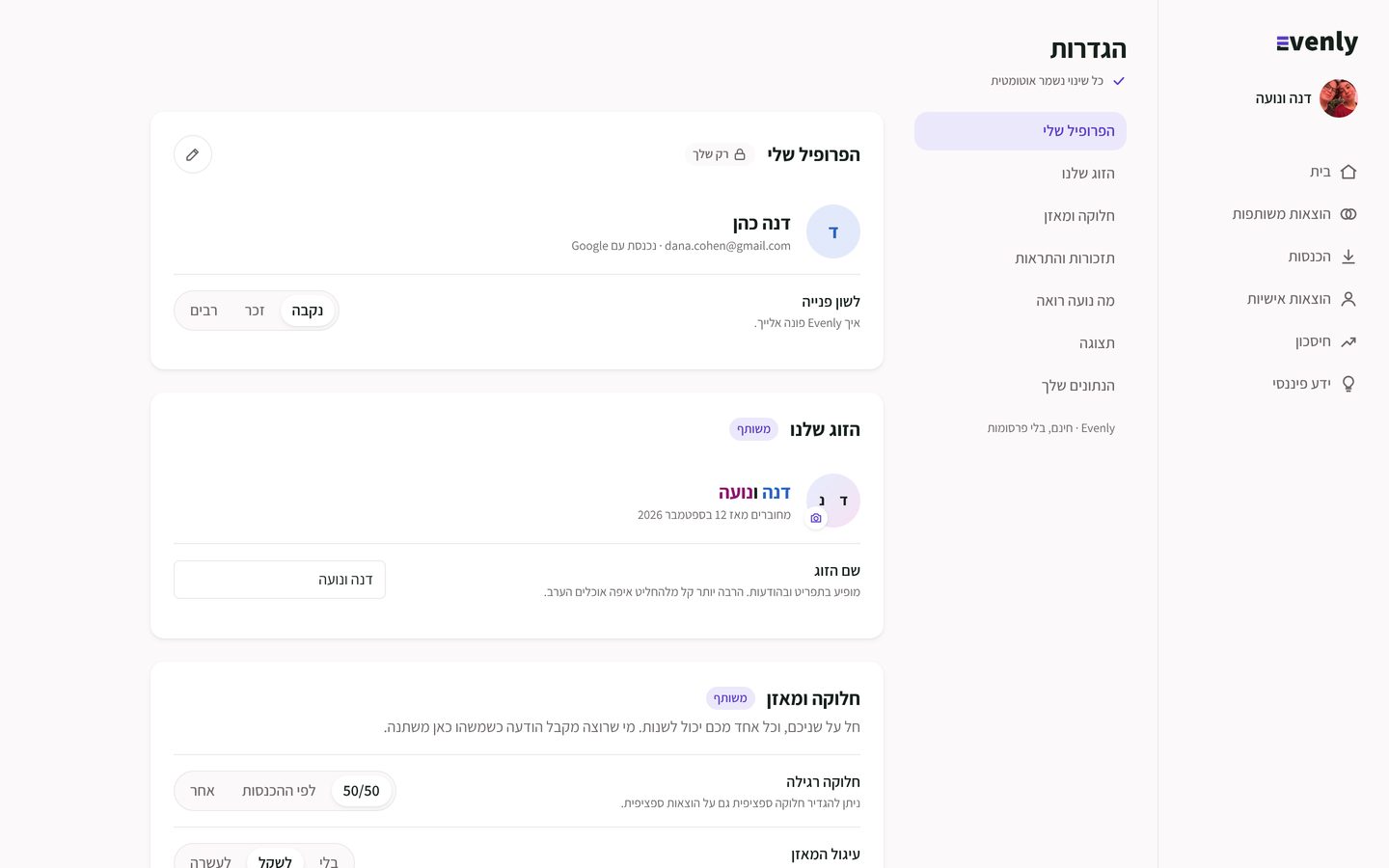
Flexible settings, instead of one fixed rule.
Some split 50/50, some by income, some keep a few things apart. So each couple sets their own split, how the balance rounds, when the month closes, and what each partner sees.
Personal spending stays personal, and still makes sense.
Personal expenses never enter the balance. Each partner sees their own spending by category, next to their part of the shared costs, and decides in settings whether the other can see it.
One word changed the product
Dana owesneeds to send Noa 420₪
Money between partners is not a debt. So Evenly never says "owes", and owing is never red.
Process
I directed. The AI drafted.
Claude drafted each screen inside a system I defined. I reviewed element by element, and every decision became a standing rule. Nothing was final on the first try: most screens went through several rounds of changes, and I decided what stayed.
- I set the language.The first draft was green. I changed the primary color to the violet and set a color for each partner, then fonts, spacing and the idea behind the whole look. I explored design directions with the AI, and chose.
- Notes became rules.Many comments and small changes at first. Once we understood each other and everything was a rule, screens came very fast.
- Reality checks.I checked that everything works on every screen and size, and that other people understand what to do when they meet the site.
- No debt language
- Nothing that costs money
- No grey data series
- Even corners
- No settings the product can decide
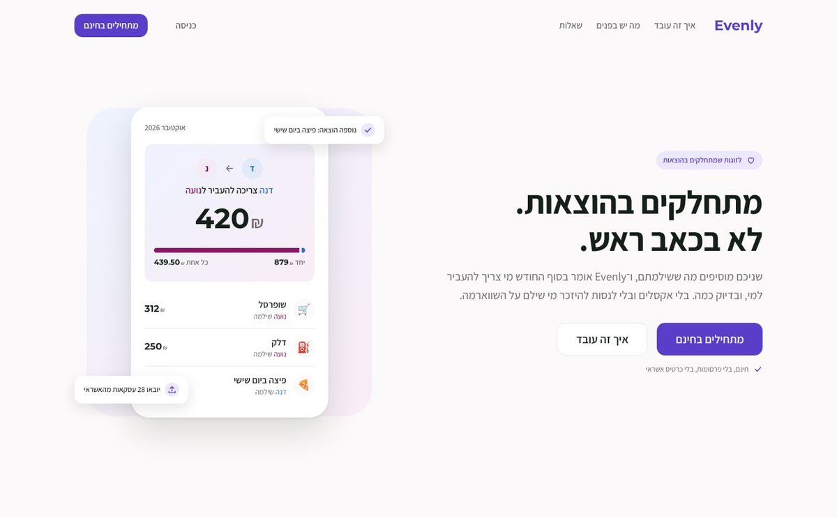
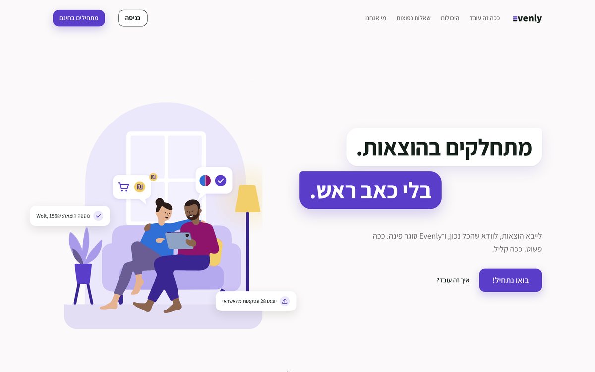
8 pages. 3 sizes each.
Desktop, tablet and phone, every button wired.
▶Try the prototype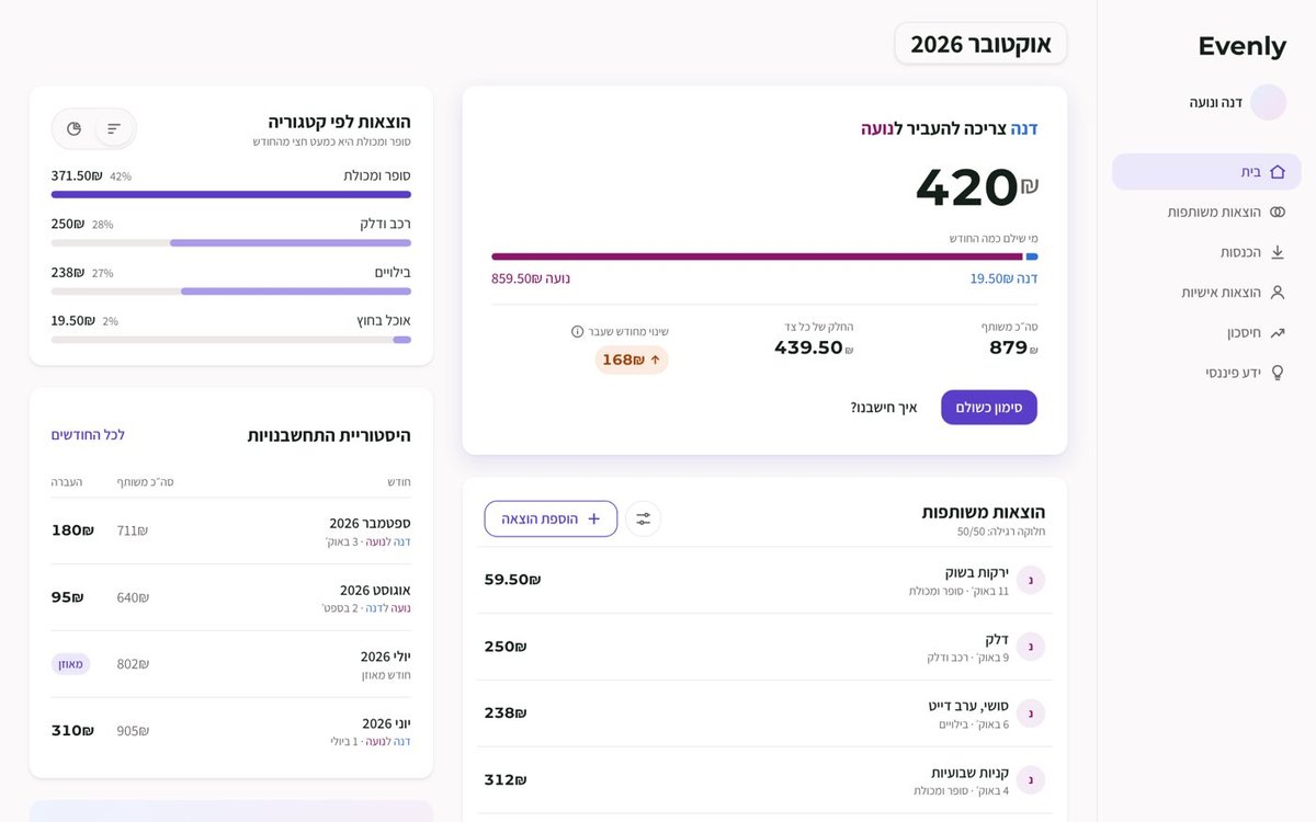
Brand and design system
One violet, in the middle of both partners’ colors.
Logo

The E is two even bars. The two violet bars make an = sign, because the goal is "even".
Color
Type
Assistant for Hebrew, Montserrat only for amounts. 8px grid, 14px corners, 40px touch targets, all text AA.
Where it landed
The clickable prototype.
A guided tour through the real prototype: tap the glowing spot or press Next. The app is in Hebrew, like the product, and every button is wired.
Next project
Clarity →