
Case study · Identity · Illustration
The Fields. My own artist brand: one dreamy, nature-led identity for five different crafts.
- Role
- Artist, brand designer, illustrator
- Type
- Personal artist brand
- Year
- 2025 to 2026
- Tools
- Procreate, Illustrator
The problem
One artist. Five crafts. Five different voices.
Digital art, painting, ceramics, jewelry and handmade prints. Each one looked like it came from someone else.
The solution
One brand that holds them all.
The Fields is the dreamy side of my practice. Its world blends dreamy nature with human emotion, and kitsch with quiet depth, and it had to work on cards, packaging and market stalls.
Step 1 · Plant the criteria
Everything had to pass four words.
Step 2 · Draw the mark
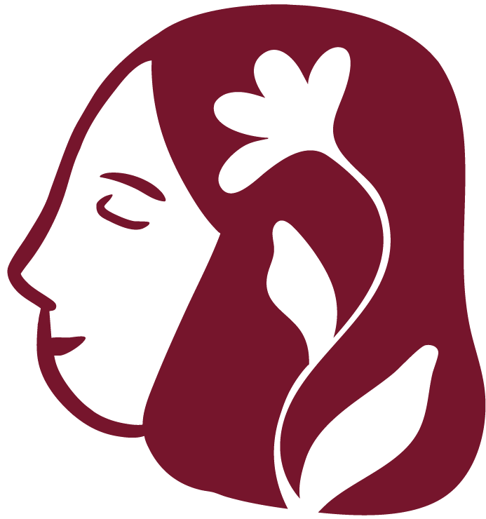
A dreaming face with a flower in her head.
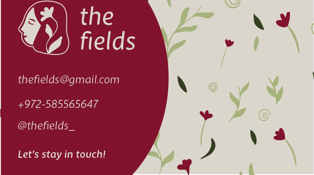
Hand-drawn in Procreate: closed eyes, a flower and a leaf growing from her hair, next to a soft, rounded wordmark. It carries all four words in one shape, and it works in wine on light and cream on wine.
Step 3 · Name the colors
A consistent palette with catchy names.
Step 4 · Choose the voice
New Zen
A refined, humanist typeface that balances softness with clarity. Its gentle curves match the hand-drawn flowers and keep everything readable.
The result
Out in the world.
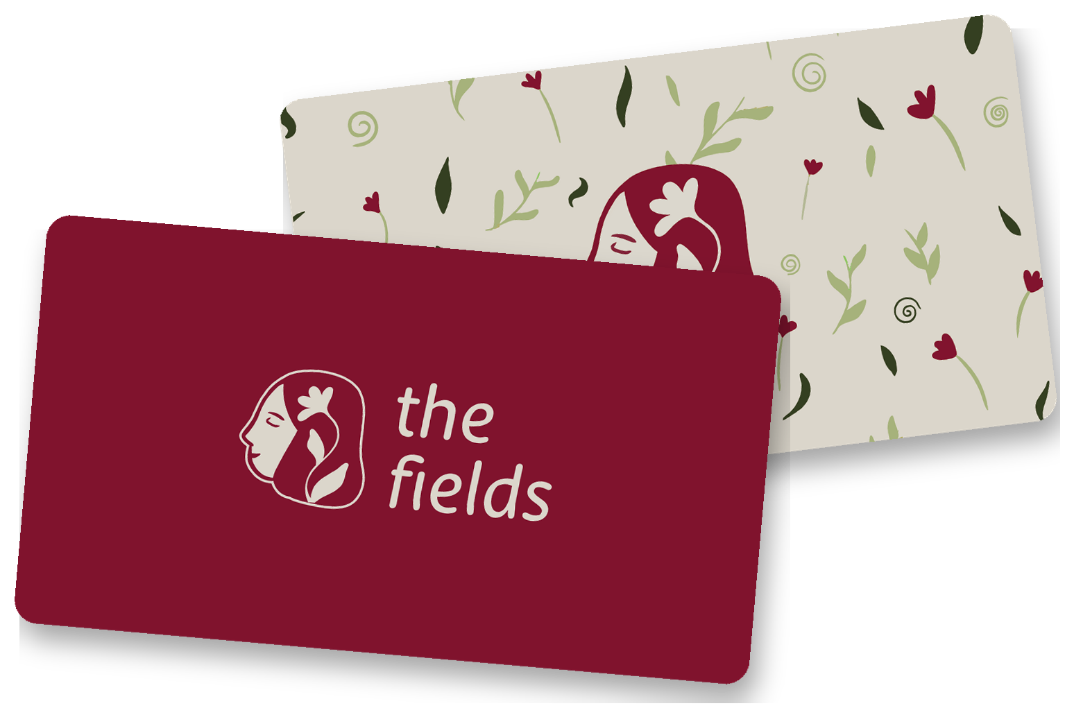
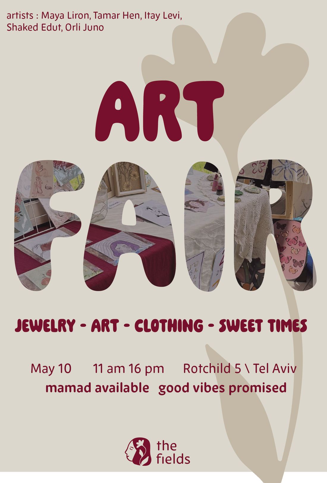
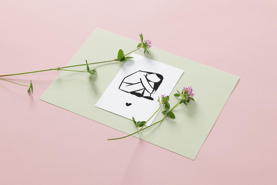
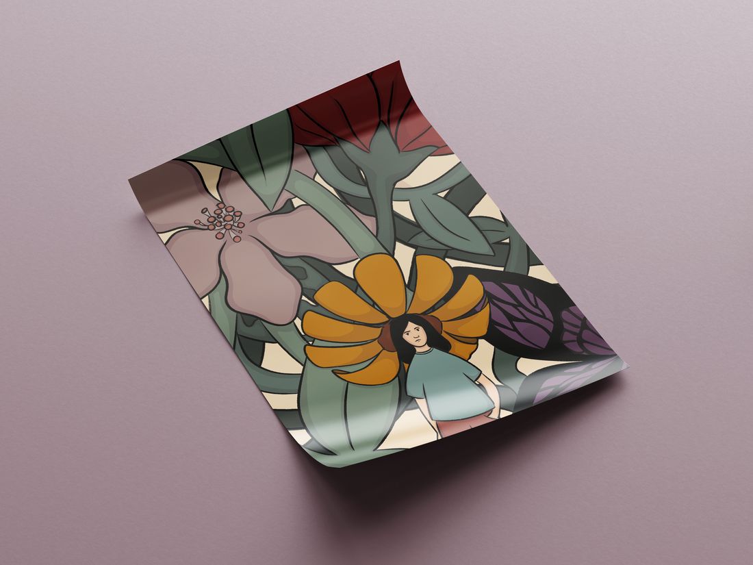
Cards, totes, prints and a fair poster: everything a market stall needs, all speaking with one dreamy voice.
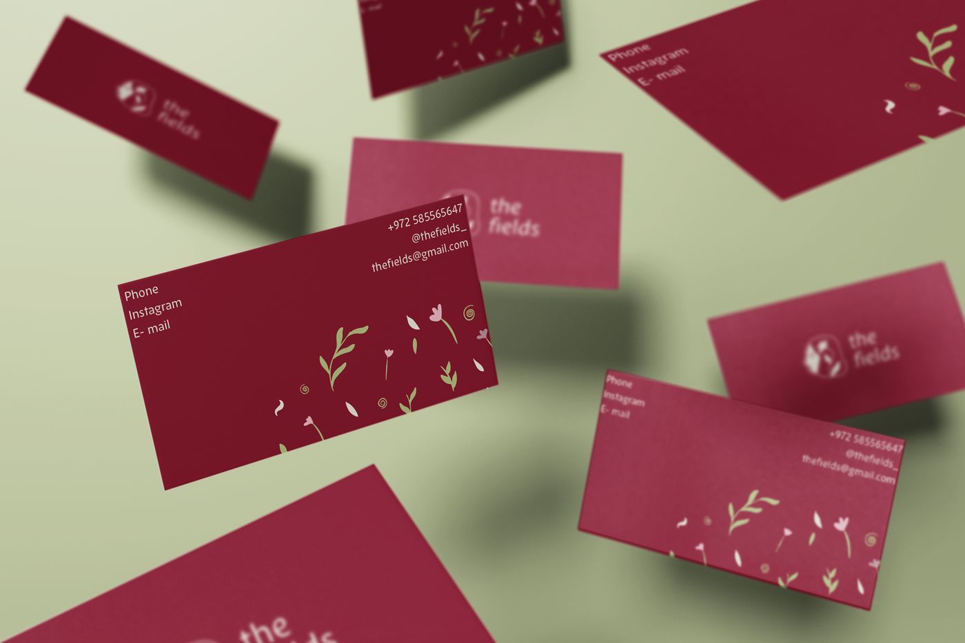
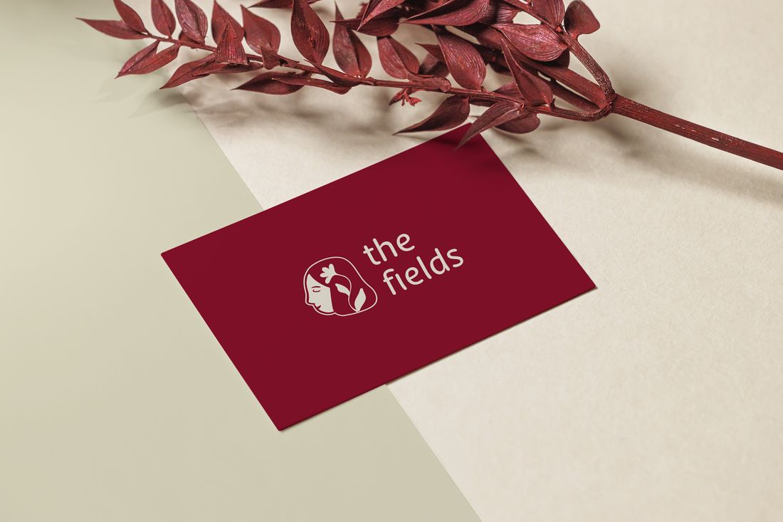
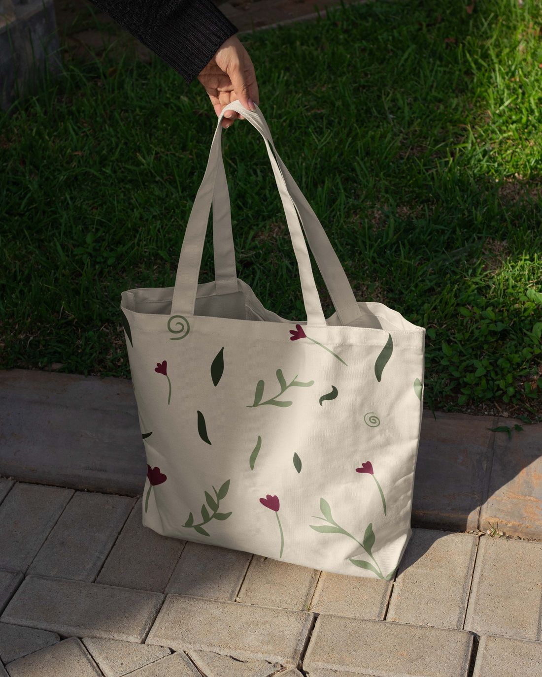
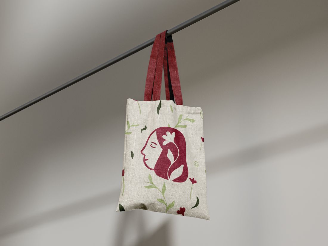
Naive on purpose.Lovely by design.
Five crafts that used to look like five different people now grow from one field: one mark, one named palette, one voice, from a business card to a market stall.
Next project
Evenly →